Modern interfaces have gotten worse. And it's being sold as progress
This analysis began with a simple task: choose a video from YouTube recommendations on a laptop. It raised a broader question: why do new scale, layers, and features so often weaken overview, control, and feedback?
The same trade-off appears across other flagship interfaces. New layers, effects, and features scatter attention, hide controls, or weaken feedback. I call it degradation when a specific user task gets worse after a change.
A bigger YouTube screen doesn't give you more choice
YouTube stretched the grid across almost the entire window but kept three videos in each row. Every thumbnail became a poster of its own, and the row stopped working as an overview of options.
For comparison, I constrained the content column without changing the page structure. The cards became smaller, more content fit in view, and the titles and thumbnails were easier to compare.
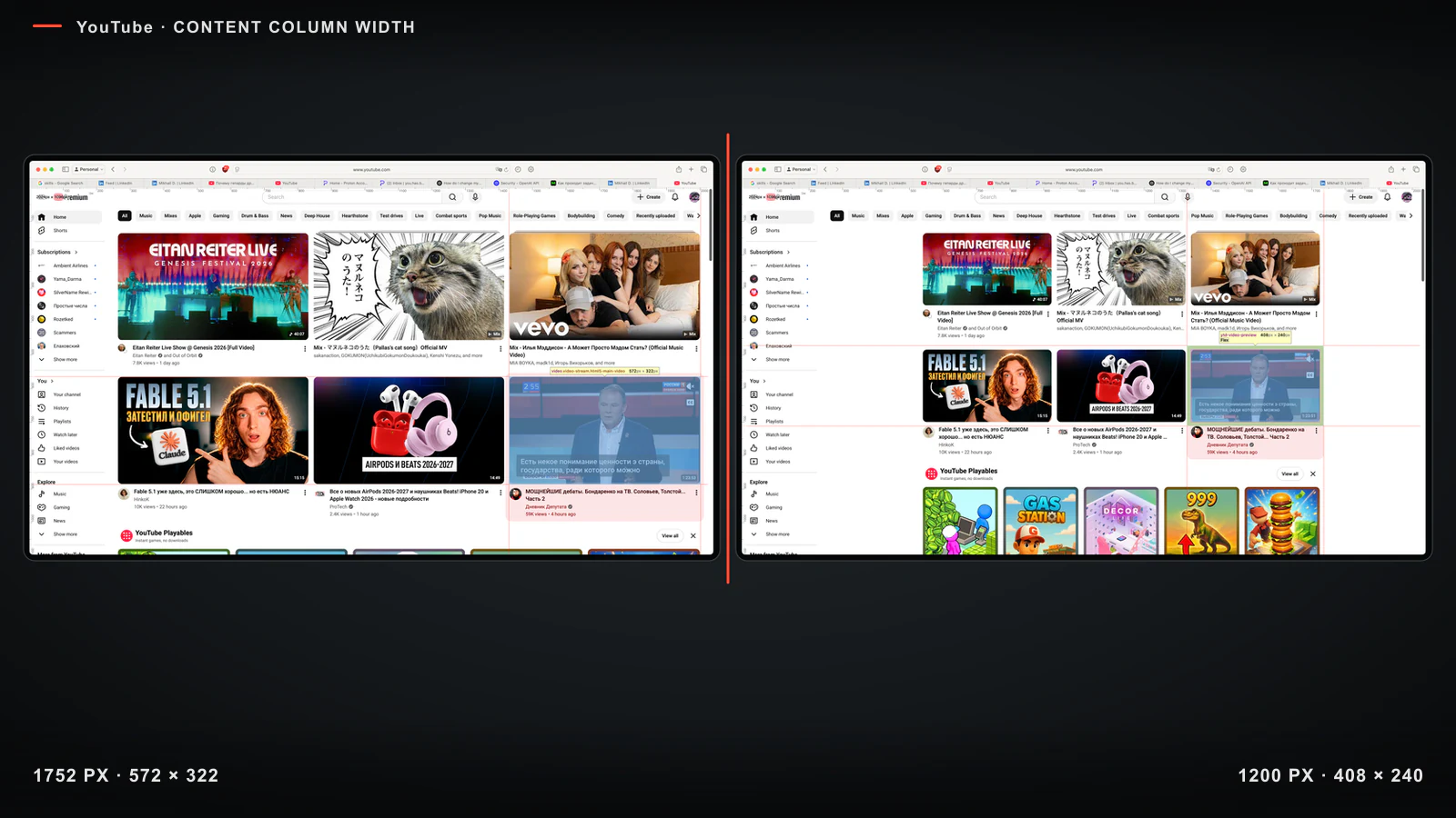
Left: three stretched cards. Right: the same grid in a narrower column.
Research supports only the general mechanism. A wider field can slow serial search (Chen, Liao, and Yeh), while the effect of viewing distance is nonlinear (Lou et al.). In Swifter, a denser overview helped people find a familiar movie scene faster. These experiments show that geometry affects search, but they do not establish a universal card size or measure the choice of a recommended video.
Extra space is useful while it increases available choice, legibility, or control.
Density depends on both quantity and presentation
Element count describes only part of the load. I separate two layers:
- Content density is the amount of information and action available in a screen area.
- Visual density is the number of signals competing for attention: borders, colors, highlights, sizes, and layers.
On the Best Buy screen, the task is to compare the memory and prices of the first three MacBooks. The offers are useful, but badges, color options, and links to other collections compete with the required attributes.
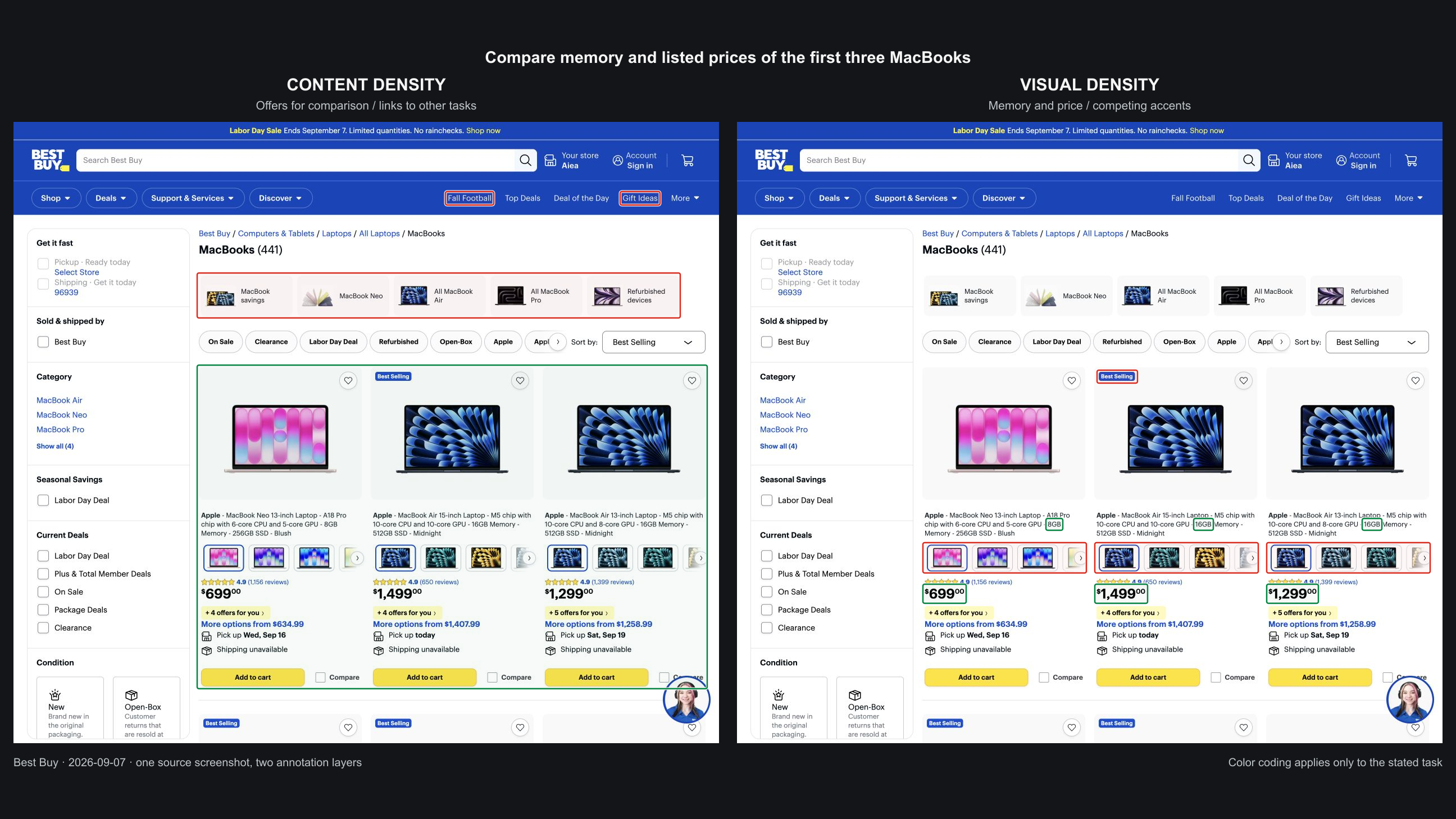 Content density
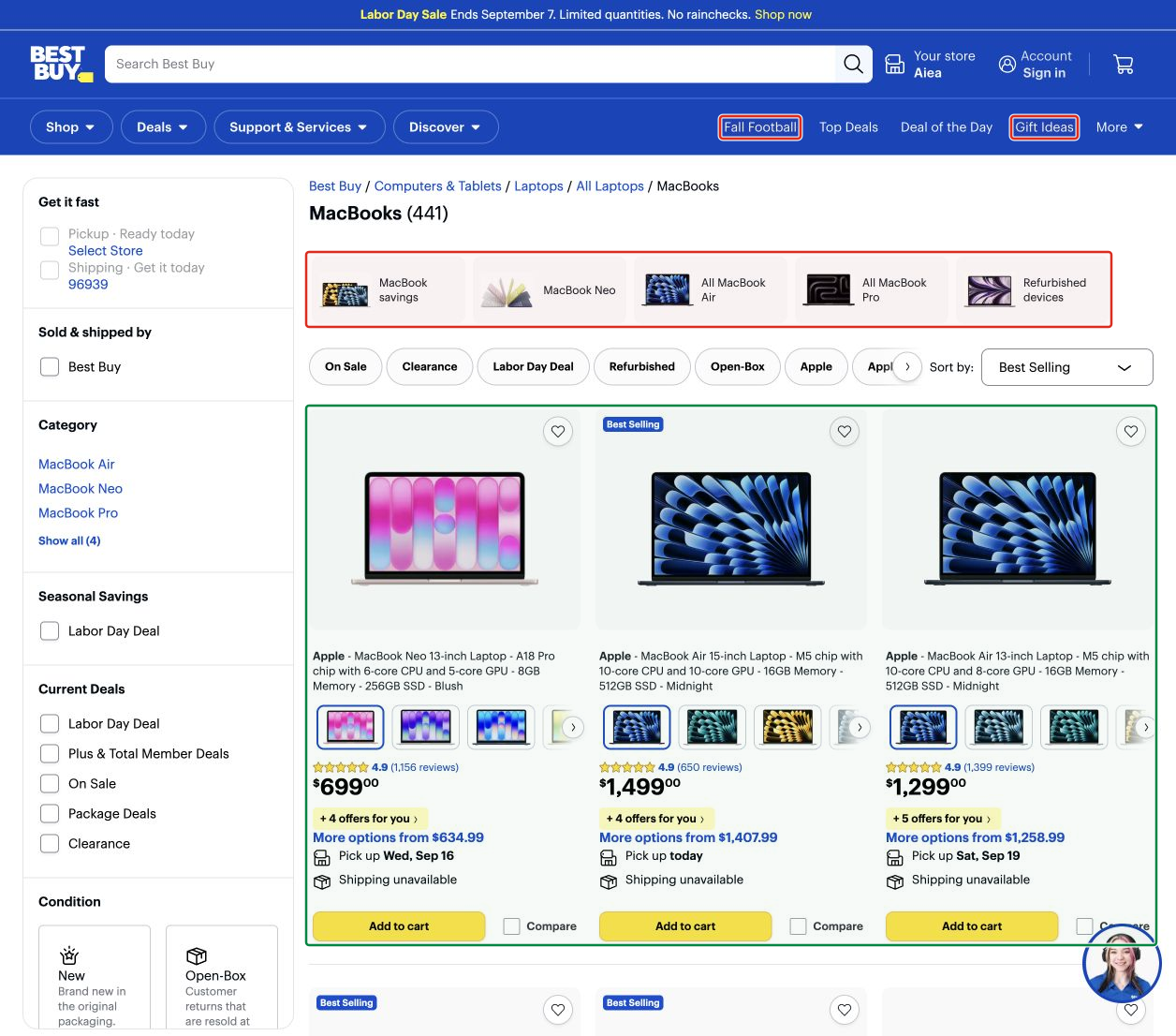 Visual density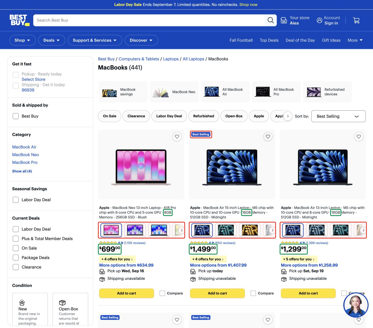
Green marks what the comparison needs; red marks accents that distract from this task.
Large cards can feel heavier than a dense professional table. A table remains usable when its rows are predictable, columns are comparable, and the required value is easy to find. Research on visual clutter connects perceptual difficulty to feature density, while visual crowding explains why similar neighboring elements make a target harder to recognize outside central vision.
In macOS 27 chrome, visual clutter penetrates everyday productivity tools. In Safari, the segmented tab bar substrate turns the top of the browser into a heavy grey slab with dark hollow holes in inactive tab slots. For an element visible 100% of working time, this substrate adds perpetual visual noise instead of serving as a neutral frame for web content. Meanwhile, in system menus, reserving an oversized left gutter for rare checkmarks (✓) pushes all labels rightward, producing ragged stepped alignment when items with and without icons mix.
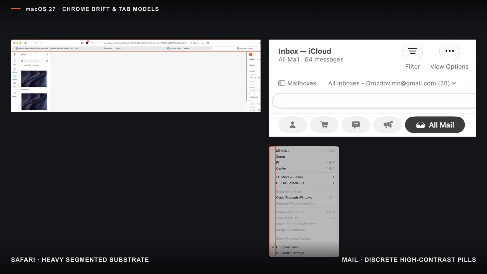
Left: a continuous dark tab substrate in Safari clutters the browser header. Right: a reserved checkmark gutter pushes all menu labels rightward.
Where additional content starts to get in the way
In a laboratory search task, Semizer and Michel found that both more possible target locations and a more cluttered background increased mean search time. That establishes an effect of quantity and clutter in that task. It does not provide an acceptable laptop-selection time or a card limit.
A catalog threshold needs to be tested with a real question, such as: “Which laptop with 32 GB of memory is the cheapest within my budget?” Compare sets of different sizes while keeping the target offer and presentation constant. Measure time, accuracy, and unfinished attempts. An unfinished attempt is not automatically product churn; churn requires its own product measure.
Instagram and Threads provide a useful counterexample. They have many features, but less common capabilities appear as they are needed. Some become harder to discover, yet the everyday screen does not turn into a permanent inventory of the product. Feature count and perceived density are different things.
Launchpad and Spotlight served different tasks
The old Launchpad was a finite spatial map. People arranged apps into pages and folders, then recognized them by location, neighbors, and color even when they forgot a name.
In macOS Tahoe 26, Apple moved app browsing into Applications inside Spotlight, a central place for apps, files, and actions. Search, categories, grid or list views, and results from different sources now share one surface.
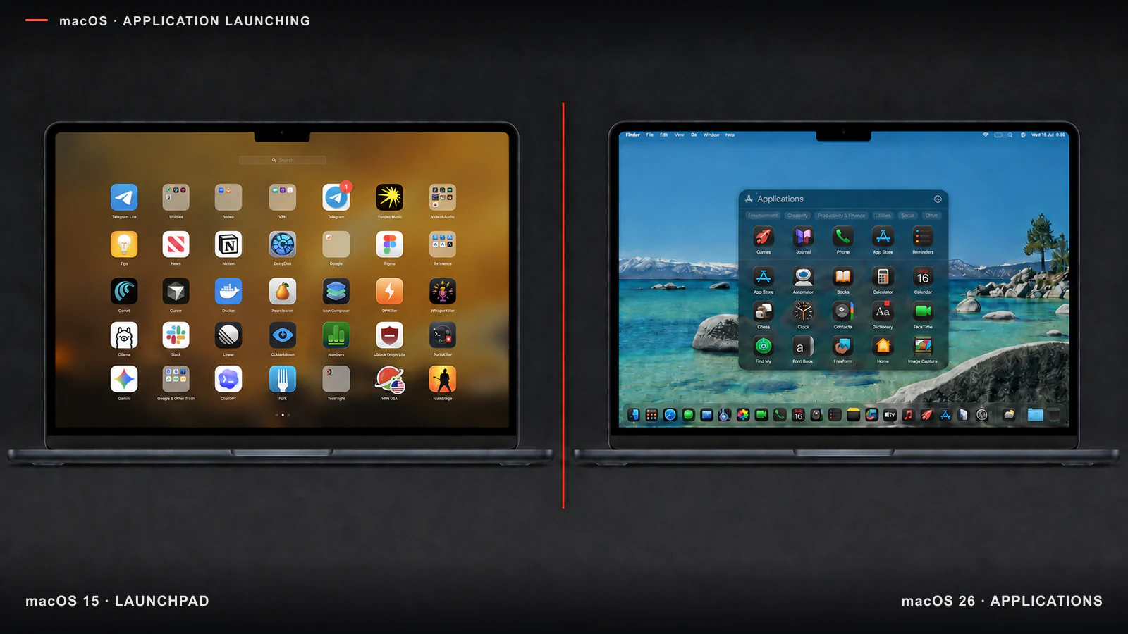
Launchpad keeps a finite map; Applications combines browsing with search and categories.
Search begins with a name. Visual browsing begins with recognition. Organization begins with a user-defined order. These tasks can coexist, but one should not displace another. In Applications, the active search field and categories create competing first steps, while a vertical list does not restore the user's arrangement. Apple's HIG allows a shared discovery area when searching and browsing support each other; here the combination weakens the spatial model without an equally clear replacement.
Uniform icons remove quick recognition cues
In the macOS 26 dark set, similar black backgrounds reduce the difference between large areas of color. An app has to be recognized by its inner symbol, label, or position. Apple shows this treatment in its overview of the new icon system.
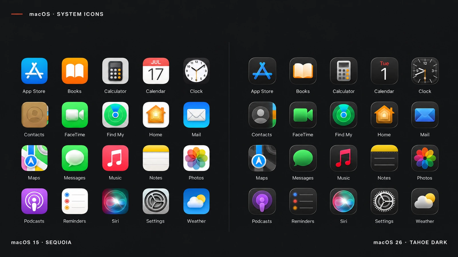
The right side is a third-party reconstruction: it shows the shared mask and color mass, not exact system rendering.
Standardization began with macOS Big Sur, but earlier icons retained large color cues. The dark treatment weakens those too. It does not make every icon identical: Photos and App Store remain easy to recognize. Still, search gets harder when a target resembles its neighbors (Duncan & Humphreys), and a noticeable color difference is itself a search feature (Nagy & Sanchez).
Apple's HIG asks for unique, memorable icons that people recognize at a glance. Dark backgrounds make the set more consistent by weakening some of the cues that supported that recognition.
Every boundary has a cost
In macOS 26, some sidebars became separate glass surfaces inside an already outlined window. One structure gained two nearby boundaries and two layers of spacing.
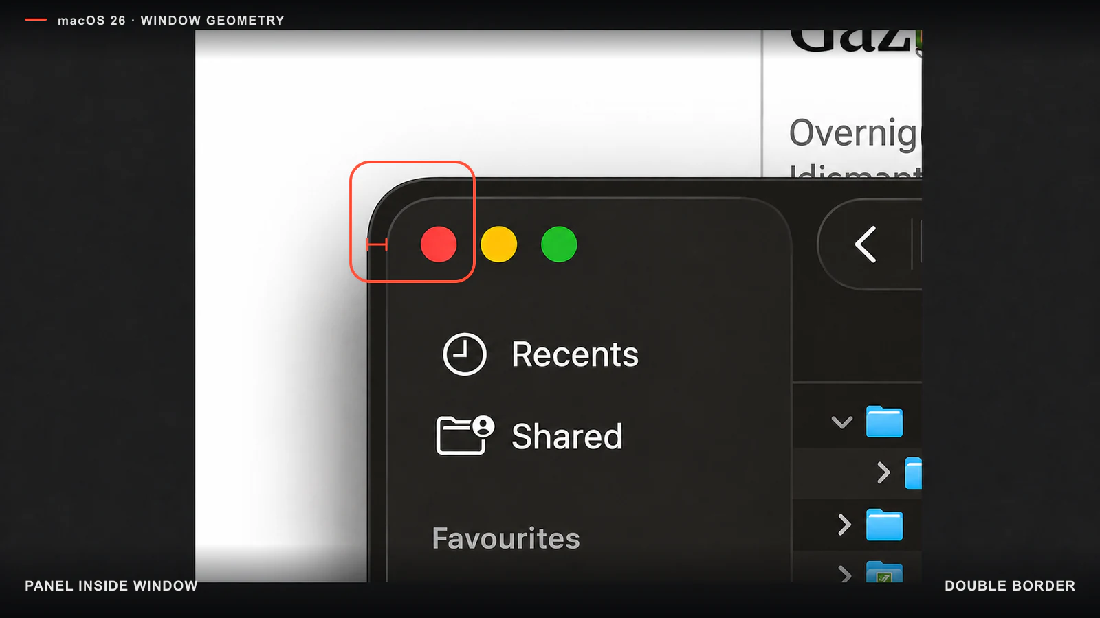
The extra shell repeats the window's shape and takes space away from content.
A later version removed this particular double structure. It was not an unavoidable property of Liquid Glass: the geometry could be corrected without losing functionality.
A boundary earns its place when it explains behavior: a panel sits above content, moves, or appears temporarily. When it remains fixed like an ordinary sidebar, a glass shell adds area, nesting, outlines, and contrast states without adding an action. Apple itself recommends separating controls from content rather than layering the material without need.
In macOS 27, this pattern worsened: floating pill capsules (< > Documents, view pickers) hover over an entirely empty grey toolbar row. The purpose of floating glass pills is to separate controls from dynamic content scrolling beneath them. Floating over a blank, static panel turns them into pure decoration that multiplies outer margins and eats away window height.
Plane hierarchy breaks simultaneously. The entire top header is now one continuous panel, yet on the right the toolbar buttons spill directly over the preview itself, even though the preview should occupy a separate plane from the main canvas. On the bottom edge, the path bar loses its background opacity and blur, superimposing breadcrumb text directly onto file-list rows. Inside the inspector, the tag input diverges from the system geometry as an unrounded rectangle with cramped padding.
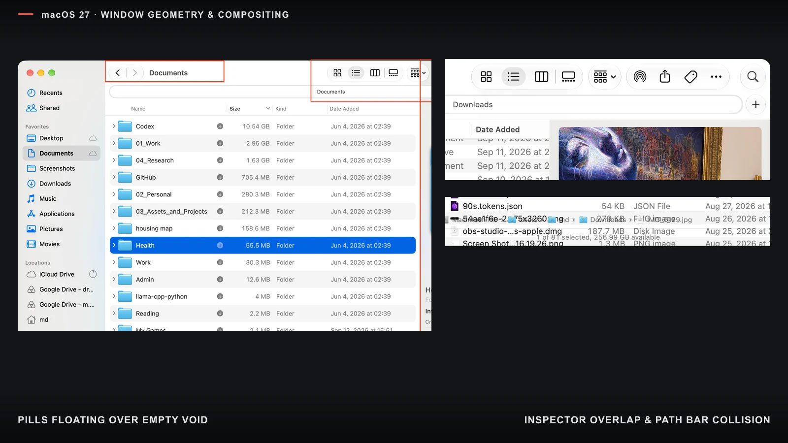
Left: floating pills hover over a continuous grey header panel. Top right: toolbar controls enter the preview itself. Bottom right: the path bar loses its substrate and places breadcrumb text directly over the file list.
The comparison below is an illustrative form study, not a functional specification. The first frame shows the current Finder composition; the second is my generated concept, moving the same floating controls to the lower edge of the content canvas so they belong to that plane.
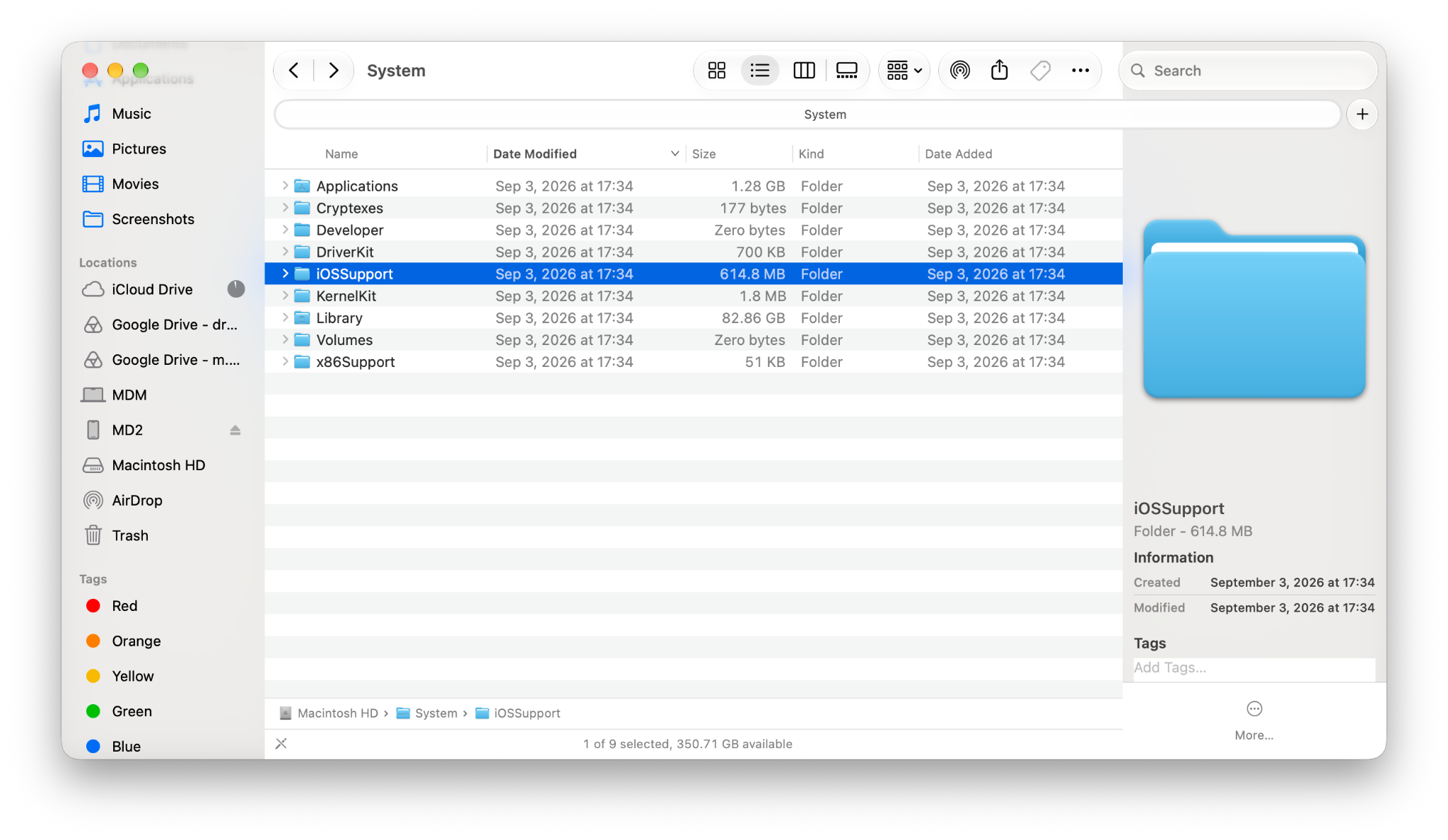 Current Finder layout in macOS 27Illustrative concept with controls anchored to the content canvas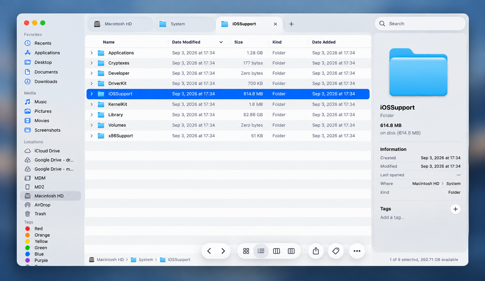
The concept is generated; it demonstrates form and spatial hierarchy rather than proposed functionality.
In Settings, Back and Forward already share one pill with an internal separator. On hover, that separator disappears, making the boundary between the two actions less explicit even though the control's functions do not change.
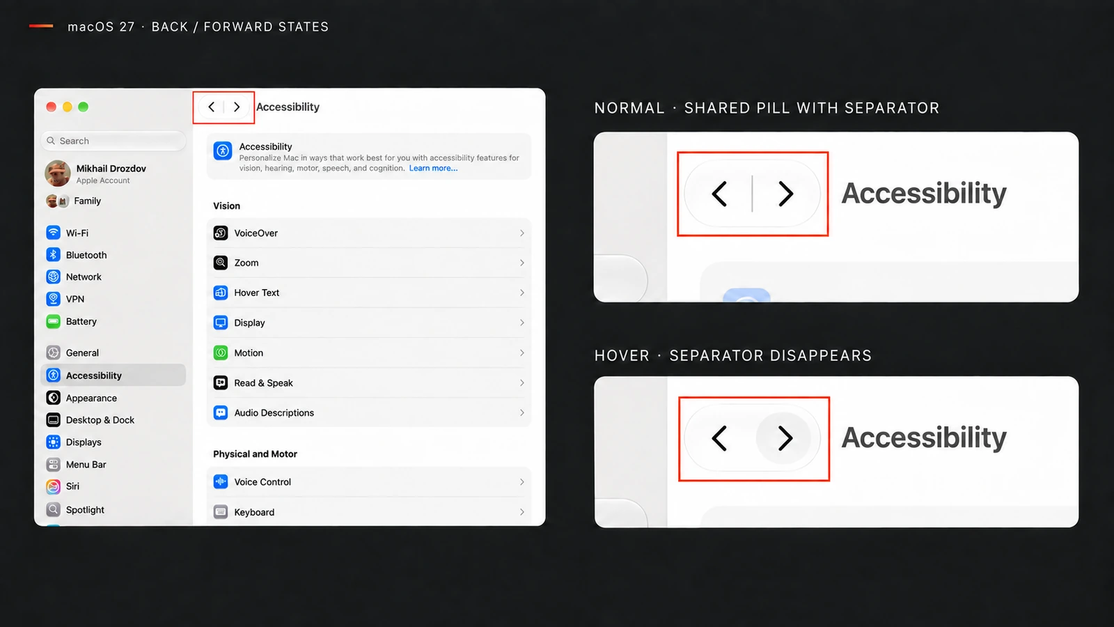
This is what I mean by design for its own sake: visible complexity grows while the task does not change. I do not know the motives of a particular team, and I do not need them to judge the result. A surface that consumes space and attention without improving grouping, control, or feedback makes the interface worse.
The interface repeats itself
On the iOS version-details screen, one fact appears three times: iOS Version in navigation, the same page heading, and iOS 27.0 inside the card.
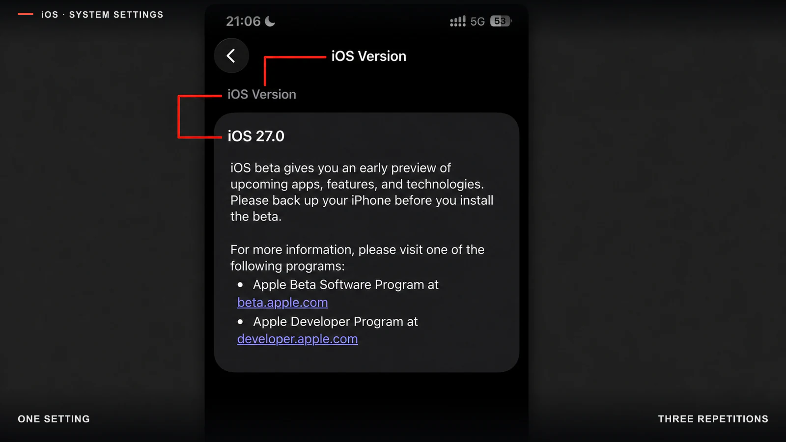
The version number adds information; two adjacent headings repeat context.
Each line is defensible on its own, but together they show that no one owns the meaning. Navigation has already established the context, so the card needs only the number and description. The screenshot cannot reveal whether a person, a generator, or several teams created the repetition. The visible defect is simpler: semantic density increased without new information.
In macOS 27 desktop windows, toolbar inflation consumes working space. In the Trash window, an entire horizontal header row merely repeats context around one Empty button, leaving a vast dead zone.
In Mail, the problem is both vertical inflation and broken nesting. A global toolbar, a Mailboxes / All Inboxes rail with vast empty space, and a separate 1 Message / Summarize row all precede the email. The higher-level filter reads as if it were nested below local message tabs. 1 Message and Summarize consume a full row instead of joining the message header beside sender and subject, while another empty vertical strip sits beside the resizable list boundary.
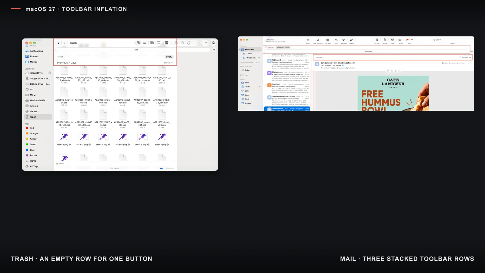
Left: an empty Trash header row for one Empty button. Right: three toolbar tiers and broken filter nesting in Mail.
Action Button: the feature exists, but the behavior model does not
In the standard Action Button settings, the user chooses one global action. There is no simple “app → action” table.
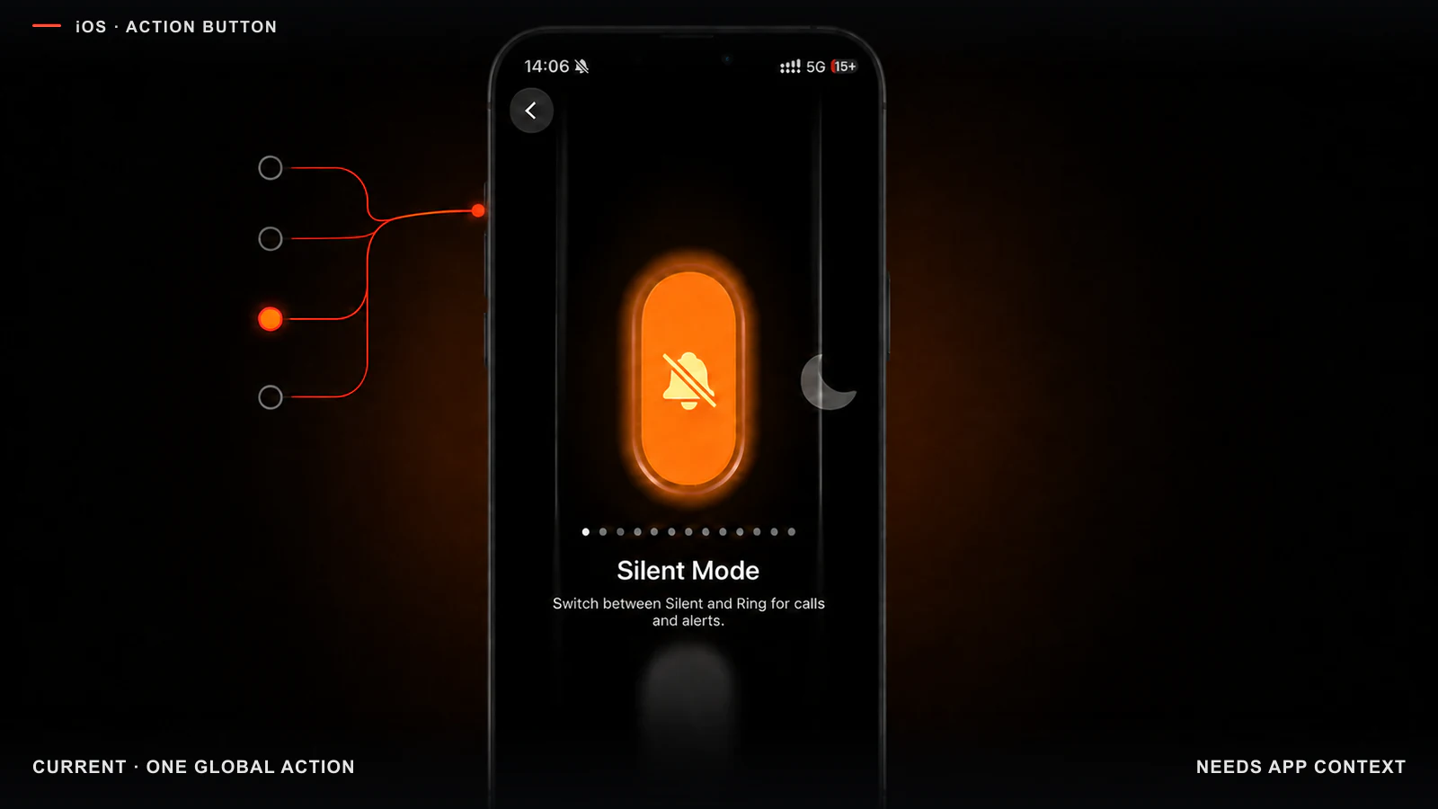
The system setting offers one button assignment for every context.
I want the flashlight globally, but in Camera the same button could reasonably take a photo. A Shortcut can inspect the current app, but the user must build and maintain the conditional logic. The technical possibility exists; a clear system model does not. That is too high a price for an ordinary hardware-button setting.
Camera Control: a hardware button with a gesture menu
Camera Control opens Camera and takes a photo with a click. Adjusting a parameter requires a light double-press to open the menu, a swipe to choose a parameter, a light press to confirm it, and another swipe to change the value. Apple's guide documents the sequence.
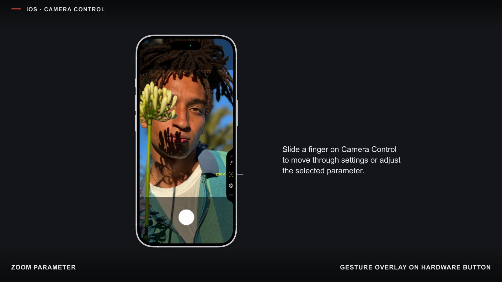
Zoom appears after the gesture opens the parameter menu.
In the hand, this model combines holding the phone, controlling press force, and moving a finger along a narrow side surface. It is especially difficult one-handed or with an unstable grip. Apple lets people adjust sensitivity and disable light-press or swipe, but configuring individual gestures does not simplify the original sequence. The hardware capability received a dedicated button before parameter control received a convincingly simple interaction.
Notification Center makes the structure a puzzle
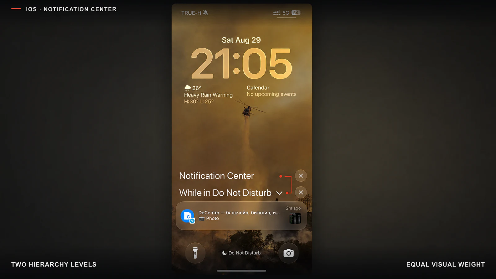
The Do Not Disturb group, notification, and two similar close buttons look almost equal.
In this state, the Notification Center heading, While in Do Not Disturb label, message card, and two × buttons speak with nearly the same visual voice. A person first has to decide which button closes the group and which closes the whole layer.
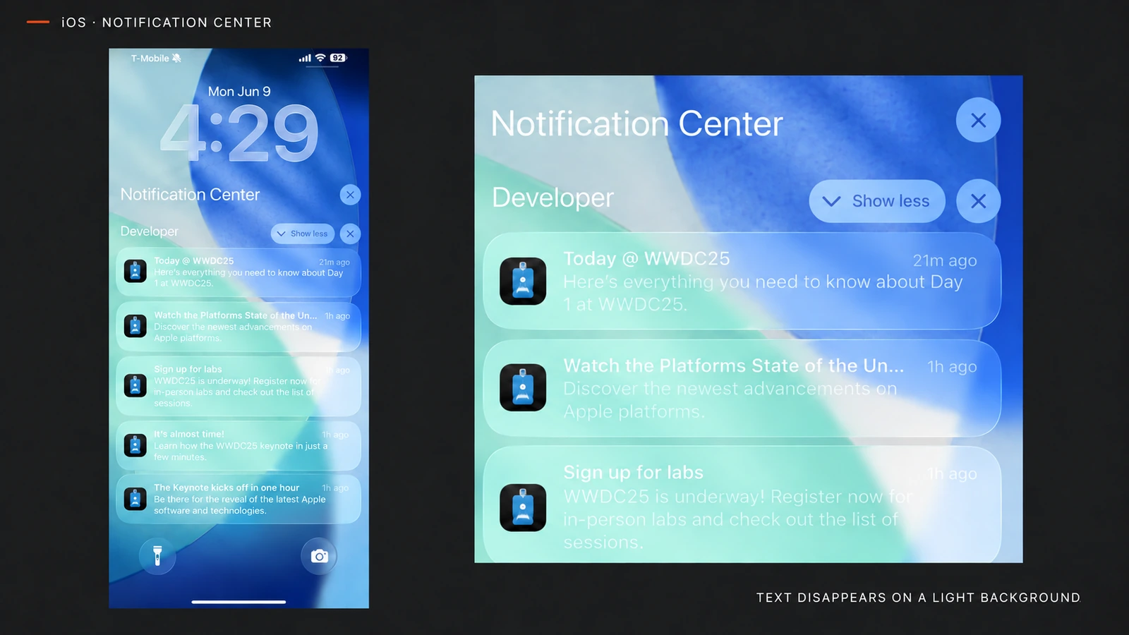
On light wallpaper, the transparent card stops separating notification text from the background.
Focus mode, app grouping, summaries, and priorities create several levels. Liquid Glass makes the conflict more visible by adding a surface to each one. Apple's HIG warns that repetition clutters Notification Center. The same principle should govern the shell: every heading, container, and close icon should help with the immediate decision instead of creating another puzzle.
Feedback should be noticeable
After a physical action, a person should immediately see that the system accepted it and what state changed.
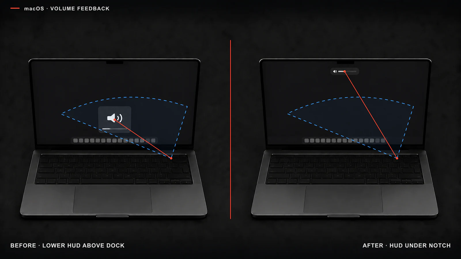
Blue marks the area around a gaze fixed on the keys: the old HUD enters it; the new upper indicator does not.
The new volume indicator is smaller, more transparent, and sits beneath the notch. The old HUD was cruder but hard to miss: it appeared above the Dock and kept a short connection between the key and the system response. When the gaze remains on the physical button, the new version pays for tidiness with visibility.
Apple's HIG requires feedback to explain what is happening and what an action caused. Proximity is not a rule for every HUD, but here the move upward is not offset by stronger visibility or a new advantage.
I adjust brightness without seeing what I am adjusting
Control Center covers the app, text, or photo that gives the brightness setting its meaning. The slider shows finger position clearly but hides the object being judged.
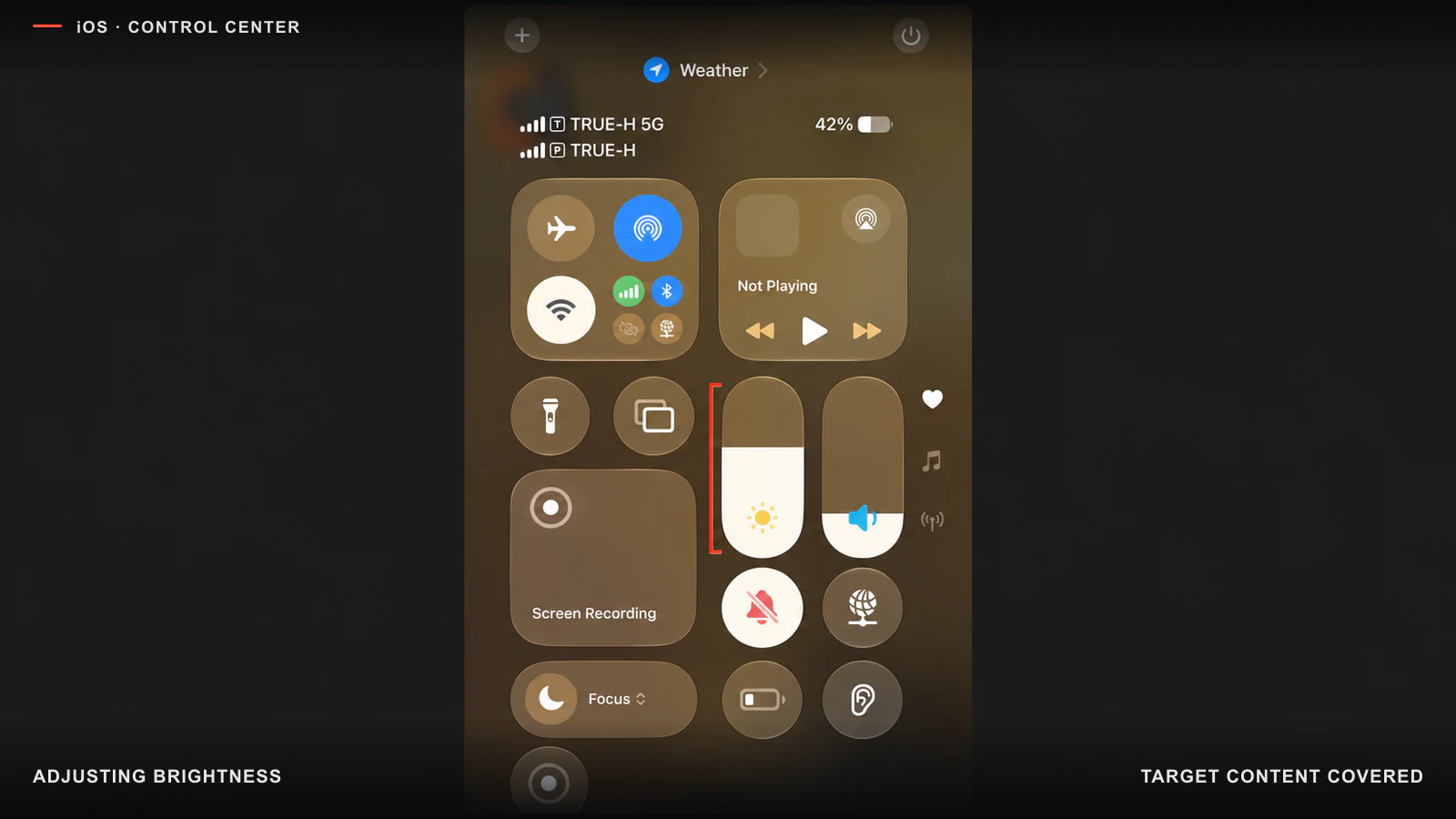
Brightness changes inside the system layer while the target content remains behind it.
This creates an extra loop: open Control Center, change the value, close it, inspect the screen, and repeat if the result is wrong. A compact HUD or preserved live-preview area would keep action and result connected.
Transparency turns contrast into a moving target
On an opaque panel, the text background is known. On glass, it changes with wallpaper, photos, video, and scrolling. One successful screenshot says little about contrast across states.
In Settings, the translucent header lets the profile row show through beneath its title, while the floating Search loses its edge against a light list and covers part of the next item.
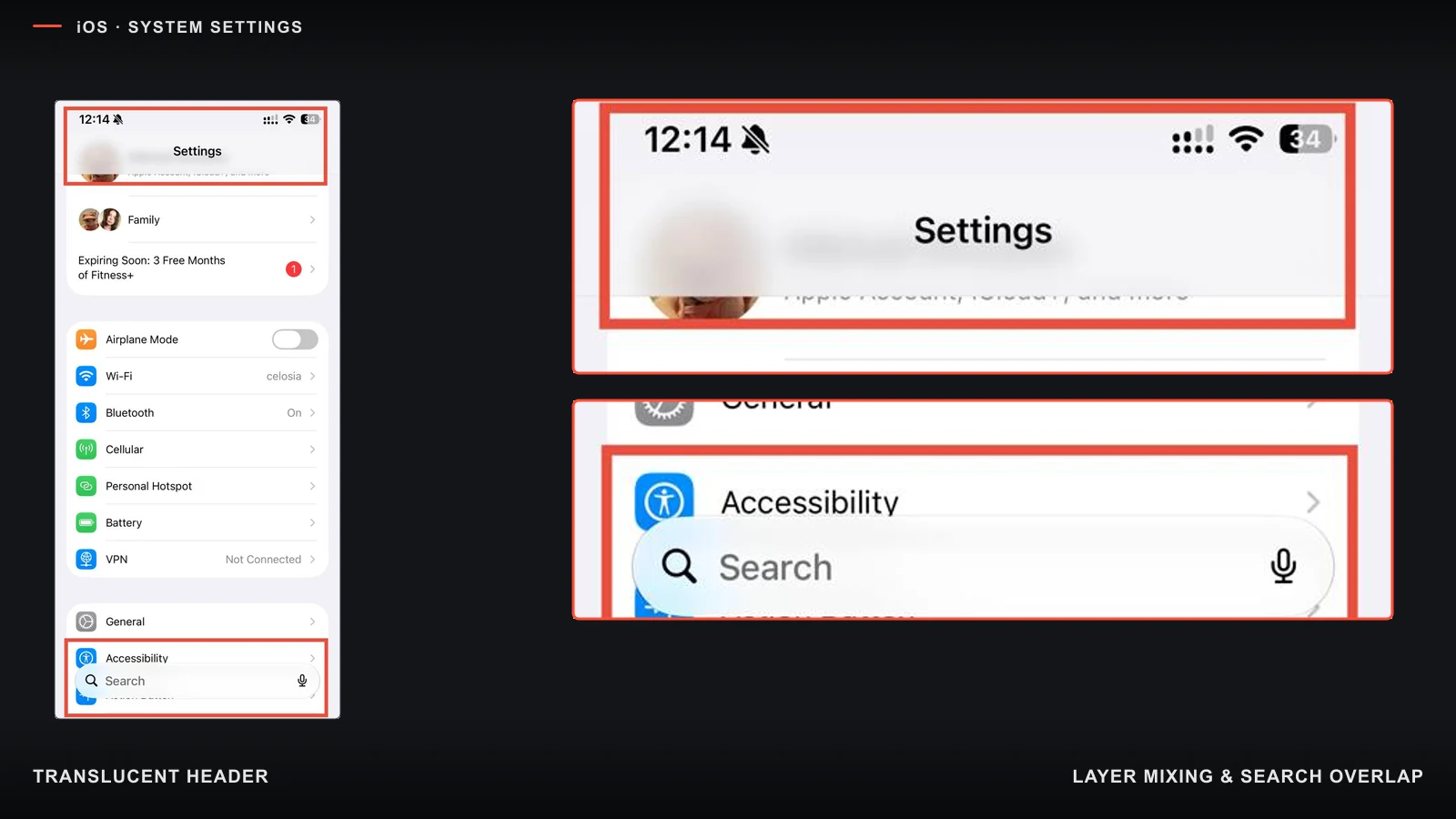
Two collisions: layers mix in the header, and Search covers the list.
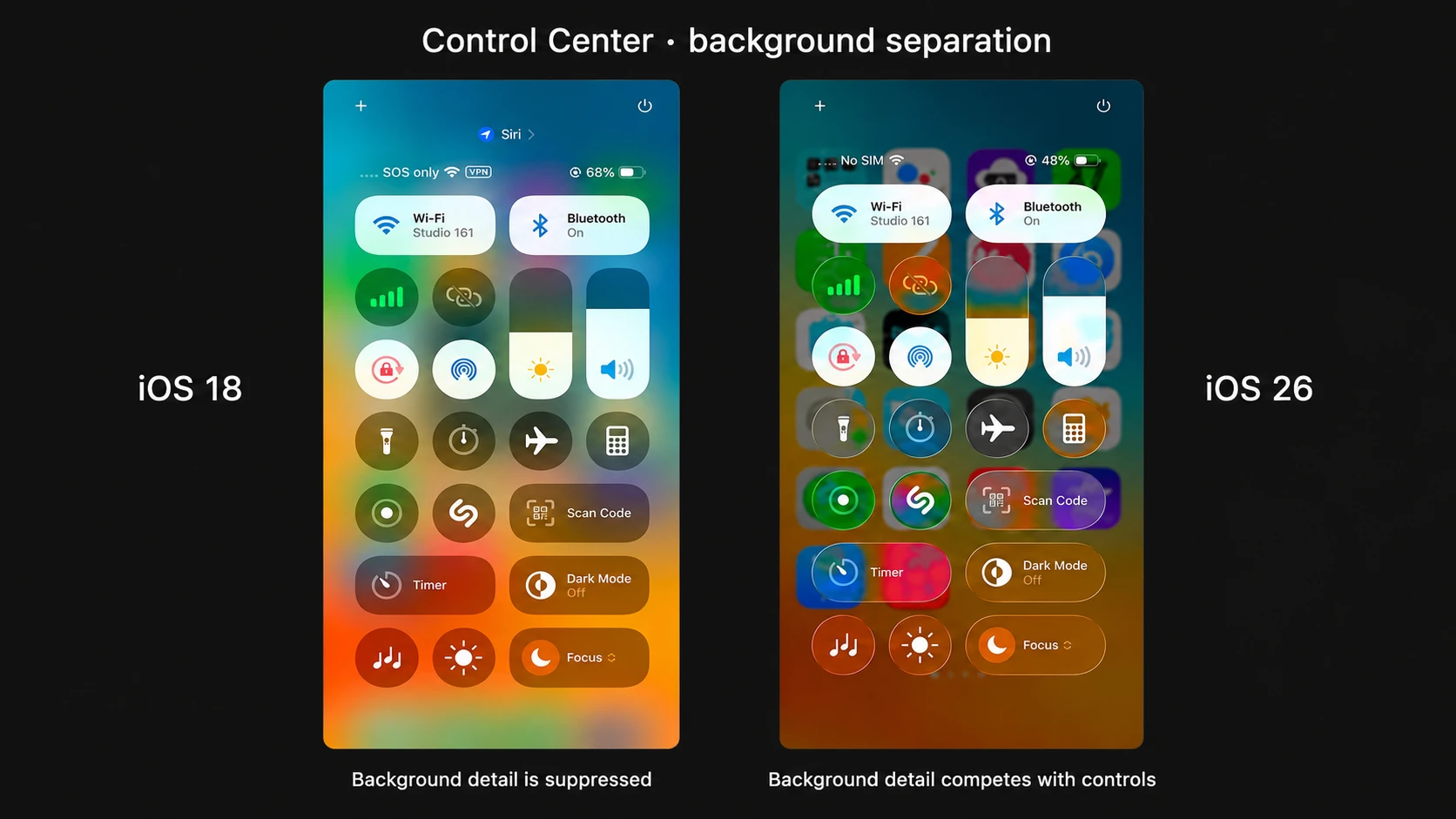
In iOS 18, blur suppresses background detail; in iOS 26, it remains visible through the controls.
Transparency itself is not the problem. The material becomes a degradation when it fails to separate controls from content and takes away working area. It needs to be checked in motion, in both themes, against different backgrounds, and with accessibility settings.
WCAG 2.x remains a required baseline, but it compares the relative luminance of two specified colors rather than the complete rendered state.
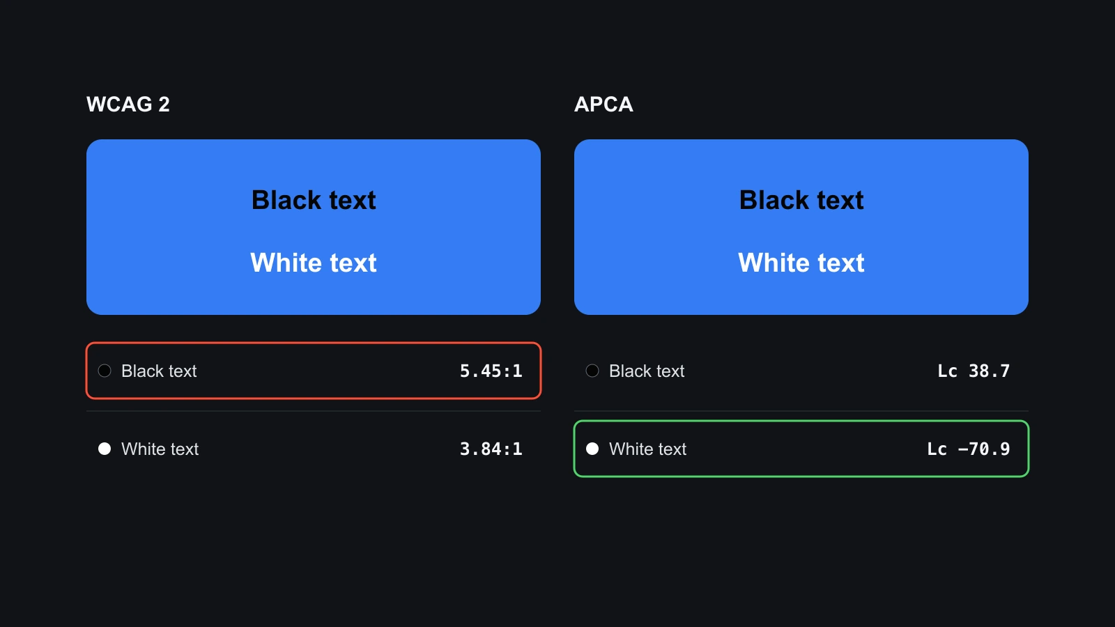
For #317CFF, WCAG 2 favors black text while APCA favors white; WebKit's analysis demonstrates the difference.
APCA accounts for polarity and text properties in more detail, but it is not the active WCAG 3 standard. A practical review combines required WCAG checks, additional perceptual diagnostics, and real rendering across every state.
iOS offers Clear, Tinted, Reduce Transparency, and Reduce Motion and Reduce Bright Effects. These controls are partial: there is no single switch for the geometry, highlights, and motion of every glass surface. The material's performance also needs separate measurement through frame time, dropped frames, GPU use, and energy; a screenshot cannot show it.
Text input changes scale and can trap the keyboard
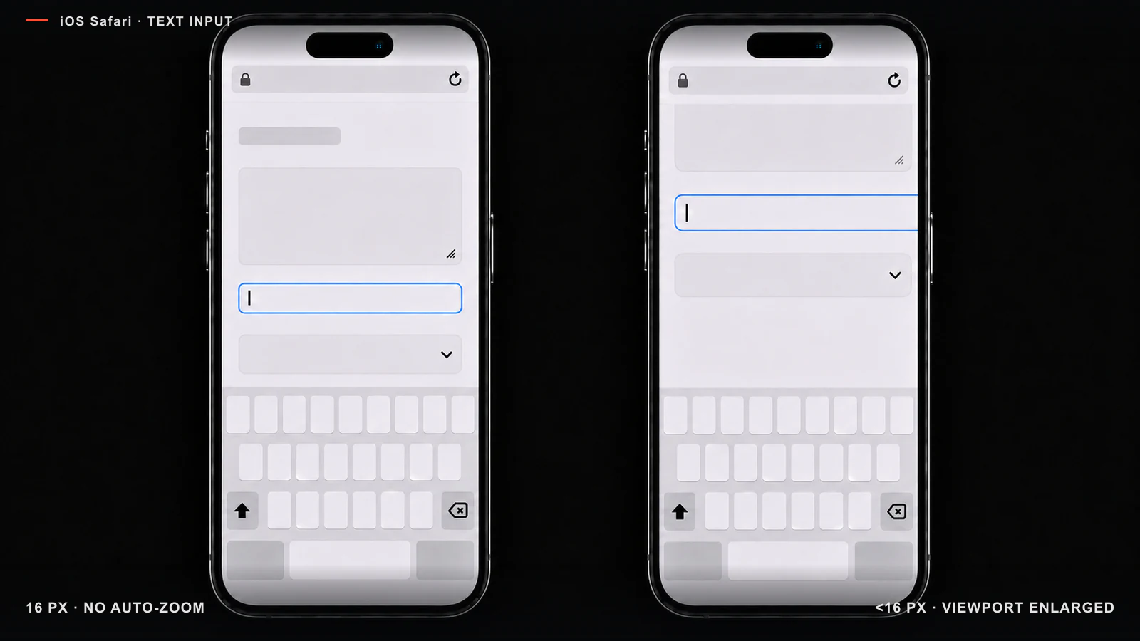
After focus, Safari enlarges the web content and narrows the available area in CSS pixels.
Mobile Safari can zoom the page when a small input receives focus. Components below roughly 16px regularly trigger the behavior, so developers raise input text to 16px. The scale does not always return after input: an attempt to make the field readable changes the geometry of the whole page.
The keyboard has no universal dismissal gesture for every app and field. In UIKit, the app sets behavior through keyboardDismissMode; SwiftUI also leaves it to the specific scroll container. If a team adds no swipe, outside tap, or Done action, there may be no obvious exit. The system does not need one mandatory gesture, but the user needs a guaranteed way to dismiss the keyboard.
The attention budget can be measured
I would compare versions through six groups of indicators:
| Indicator | What we check | What to measure |
|---|---|---|
| Choice and comparison | Whether a person finds the target and sees alternatives together | Time to first correct action; errors; comparable options; returns |
| Hierarchy and repetition | How many objects look primary and how much text repeats context | Competing anchors; wrong turns; headings without new information |
| Effective area | What share of the screen serves the task | Task-bearing content; objects before scrolling; boundaries without a separate function |
| Directness and feedback | Whether a person sees the object and result of a change | “Change → close → check” cycles; state recognition; response delay |
| Robustness | Whether readability survives between states | Worst contrast; failing backgrounds; frame-to-frame variation |
| Control and effect cost | Whether the interface can be adapted and reset; what the device pays | Steps to configure and reset; available views; frame time; dropped frames; energy |
Control should not turn an unfinished default into a build-it-yourself kit. Good settings help experienced users while the basic task remains clear without hidden options.
Production speed has outpaced verification speed
My working hypothesis is that generative tools increased production throughput faster than teams increased verification capacity. In field experiments, AI assistants produced about 26% more completed tasks. At one AI-first company, PR output and reviewer load doubled, while the share receiving substantive human review fell even though rollbacks did not increase.
Other results resist a simple story. DORA 2024 and 2025 associate greater AI use with productivity and pressure on stability; in a separate task, code produced with Copilot passed tests more often, while experienced open-source developers in the METR study worked more slowly than without AI.
These studies measure software production and verification, not the interface quality of Apple or YouTube. They support only the proposed mechanism: change volume can grow faster than review. They do not establish causation for the screens examined here.
The risk appears when locally reasonable blocks are assembled without an editor for the whole: several headings repeat one meaning, new containers multiply boundaries, and edge states go unchecked. Companies need a dedicated loop for UX QA, accessibility, information noise, and hardware-software feedback. Agents can cycle through states and find contradictions; the responsible designer and real users still decide what helps.
How to test this degradation
Each current interface needs an alternative that changes one suspected source of loss:
- for choice and navigation: a constrained YouTube grid, a finite app map, and icons with stronger color cues;
- for the control model: a contextual Action Button table, direct Camera Control parameter selection, one owner for
iOS Version, and one primary Notification Center level; - for feedback: a noticeable volume HUD, brightness over visible target content, and a guaranteed exit from text input;
- for material: integrated and floating panels in the same task, with glass tested across backgrounds and motion.
Participants find a familiar object, choose a new one, compare options, change a state, and go back. Interface order changes between participants. Ask for preference after the task: before interaction, people judge the picture; afterward, its performance.
What I am claiming
There is degradation in the scenarios examined. New scale, layers, and functions reduce overview, control, or predictability without an equivalent gain for the task. This conclusion applies to the interfaces shown; it does not require a claim that everything used to be better.
The cause remains a hypothesis. I think production speed has grown faster than the culture of verification, while design for its own sake helps justify visible activity where the user model remains unfinished.
Useful density means the most actionable information with the least competing noise. Sometimes that requires showing more, sometimes leaving space, and sometimes removing a beautiful surface that does nothing.
Sources
- Rosenholtz, Li, Nakano — Measuring visual clutter
- Whitney, Levi — Visual crowding: a fundamental limit on conscious perception and object recognition
- Apple Support — Use and customize the Action Button
- Apple Support — What’s new in Shortcuts
- Apple Support — Use Camera Control on iPhone
- Apple Support — Adjust Camera Control settings
- Apple Support — View and respond to notifications
- Apple Support — Change display colors and reduce transparency
- Apple Support — Customize onscreen motion and bright effects
- Apple Support — Narrow Spotlight search results
- Apple Developer — UIScrollView keyboard dismissal modes
- Apple Developer — SwiftUI scrollDismissesKeyboard
- HeroUI — iOS input font-size auto-zoom issue
- Apple Human Interface Guidelines — Feedback
- Apple Human Interface Guidelines — Notifications
- Apple Human Interface Guidelines — Sidebars
- Apple — Meet Liquid Glass
- W3C — Understanding Success Criterion 1.4.3: Contrast
- W3C — Relative luminance
- W3C — WCAG 3 Working Draft
- WebKit — How to have the browser pick a contrasting color in CSS
- APCA — APCA in a Nutshell
- CIE — CIE 1976 Luv* colour space
- Apple — Design foundations: progressive disclosure
- Cui et al. — The Effects of Generative AI on High-Skilled Work
- DORA — 2024 Accelerate State of DevOps Report
- DORA — 2025 Accelerate State of DevOps Report
- He et al. — AI Writes Faster Than Humans Can Review
- METR — Measuring the impact of early-2025 AI on experienced open-source developer productivity
- GitHub — Does GitHub Copilot improve code quality?